


In 1933 the Osmania Type Foundry in Hyderabad attempted to create movable type technology for Urdu that could approximate the handwritten aesthetics and slanting style of the nasta‘līq form of the Perso-Arabic script. Specifically, the Osmania Type Foundry experimented with different fonts of typeface to render Urdu’s nonlinear script into metal typeset printing and mechanical typesetting. The Osmania Type Foundry was based in the Hyderabad State, which was one of the largest semi-autonomous princely states under British suzerainty in the Indian subcontinent.1 This article addresses a comparatively less studied aspects in Urdu print culture in which lithography predominated, namely how some prominent early twentieth-century Muslim modernists in Hyderabad experimented with movable type for nasta‘līq. In turn, the article shifts focus from the better studies histories of Urdu print in northern India to explore how the history and politics of Hyderabad in India’s southern Deccan region shaped Urdu type experiments.
Industrial letterpresses were well-suited for mass publishing books in European languages that were written in the Latin script and for texts in South Asian languages that were composed in the devanāgarī script, such as Hindi, but not for Urdu’s nasta‘līq script. In response to the expansion of both industrial publishing and English-medium education in India, the government of the Hyderabad State invested in efforts to craft movable type technology that could approximate the handwritten aesthetics of the Urdu language’s calligraphic script, nasta‘līq. Specifically in 1933, the Osmania Type Foundry celebrated “the invention and casting of the lead letters of nasta‘līq” as one of the signature accomplishments of the Hyderabad State since “the honor in achieving the revolution in type printing in the East was the good fortune of Hyderabad.”2 Indirectly echoing the Indian nationalist movement, another prominent scholar in Hyderabad, Mirza Rafiq Baig, argued that the invention of nasta‘līq movable type would enable the “āzādī” (freedom) of Urdu.3 (These were not the first experiments with type technology for Urdu since efforts to forge type for nasta‘līq dated to the late eighteenth century.4 ) For some Indian Muslim intellectuals in the early 1930s, reconciling Urdu’s calligraphic form of the Perso-Arabic script, which drew on older manuscript cultures, with type technology was an essential component of refashioning the Urdu language during an era of competing nationalisms in India.
It is important to acknowledge from the outset that the Osmania Type Foundry’s typeface products were not widely used or disseminated as lithography continued to predominate as the preferred method of Urdu publishing in twentieth century South Asia.5 Despite these practical limitations, what was the larger historical and cultural significance of these experiments with nasta‘līq movable type? In his study of the Chinse typewriter, Thomas Mullaney calls for histories of print technology that follow “the intensity and endurance of … engagement” rather than focus on technological success or “immediate effect” [italics in the original.]6 The ‘intensity of engagement’ provides a useful framework for addressing the significance of the Osmania Type Foundry’s type products, despite their limited use in the publishing sphere.7
One answer to the question of the larger cultural significance is found in the longer history of the fraught demarcation of the Hindi and Urdu languages, which has loomed large in scholarship on modern South Asia.8 Hindi and Urdu share the same grammar and spoken register. However, by the 1920s in northern India, Hindi in the Sanskrit-derived devanāgarī script was increasingly associated with Hindu majority communities, while Urdu in the Perso-Arabic script was increasingly linked with Muslim minority communities. (Examples of Hindi and Urdu are provided below.) In this way, linguistic differences were mapped onto religious communities in the making of competing Hindu and Muslim nationalisms in late colonial India. In turn, historians have thoroughly studied both the gradual making of a religiously-inflected linguistic division between the Hindi and Urdu languages and the wide-ranging ways in which many people in South Asia have challenged these divisions.9 This narrative of national division through language and religion was reinforced by the violent partition of British India into the independent nation-states of Hindu-majority India and Muslim-majority Pakistan in 1947 and the mapping, however contested and incomplete, of the Urdu and Hindi languages onto these separate nation-states after independence.
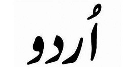
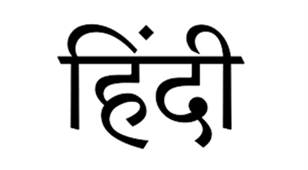
Figs. 1a and 1b: Urdu (top) is written in the Perso-Arabic script, while Hindi (bottomt) is written in the Sanskrit-derived devanāgarī script.
Beyond this familiar terrain of nationalism and religious difference, this article documents another story: how Urdu’s script style and print technologies were debated by some Indian Muslim intellectuals and printers and framed in relation to other languages that employ the Perso-Arabic script around the world. Specifically, revisiting the history of the Osmania Type Foundry brings to the fore debates within the Urdu sphere over Urdu’s script style and print technologies.10 In so doing, this article builds on recent scholarship considering Urdu’s historical trajectory beyond the fraught Hindi-Urdu divide in northern India and in relation to other languages.11 In her influential study of Osmania University, Kavita Datla argues that competition with English was a central element of Urdu educational projects in the early twentieth century.12 She demonstrates that Muslim intellectuals in Hyderabad aimed to refashion Urdu as “a worldly vernacular that would rival English as a language of business, science, and learned conversation.”13 Reconciling the calligraphic form of Urdu’s nasta‘līq script, which was connected to older lineages of manuscript production, with movable type printing became an important component of this wider project to recast Urdu as a “worldly vernacular” and to position Hyderabad as a new global center of learning.14 In particular, the Osmania Type Foundry’s efforts illustrate how Urdu’s slanting form of the Perso-Arabic script, nasta‘līq, became the site of technological experimentation, debates over transregional Islamic ties, and articulations of local Muslim sovereignty in India. Therefore, the history of the Osmania Type Foundry evokes what David Arnold has termed “the multiple understandings and experiences of technological modernity” in India.15
It is important to emphasize that the Osmania Type Foundry was just one voice in a multi-sided debate over the appropriate print technology for Urdu. Moreover, the foundry was a boutique press that aimed to display the wealth and noble virtues of the ruling family in Hyderabad. At the same time, the Osmania Type Foundry constituted a significant counter to those who viewed nasta‘līq as an impediment to Urdu’s publishing progress. In contrast to language reformers who were willing to discard nasta‘līq along with lithography, the Osmania Type Foundry attempted to craft type technology that was compatible with nasta‘līq’s non-linear style. Certainly, Urdu printers, such as those affiliated with the Osmania Type Foundry, who were committed to fashioning typography for calligraphic nasta‘līq, were outliers in the early twentieth century world of Urdu publishing in which lithography predominated. However, the casting of nasta‘līq movable type aimed to publicly demonstrate the industrial nature and mechanical credentials of Urdu in the 1930s. More broadly, these type experiments generated significant commentary on the politics of script, language, and religion in late colonial India despite their limited role in book production.
What follows is a close reading of the Osmania Type Foundry’s 1933 catalogue for its political, technological, and historical claims. Specifically, the first section of the article contextualizes the Osmania Type Foundry’s experiments in recent scholarship on Urdu print culture. In turn, the second section undertakes a close reading of the Osmania Type Foundry’s catalogue to explain how the foundry mobilized different historical narratives to market its type wares including references to Islam and Persian as well as comparisons to the Turkish language reform. Finally, the third section addresses the perspective of one of the Osmania Type Foundry’s critics in Hyderabad. As both the Osmania Type Foundry and its critics reveal, the narration of Muslim pasts and comparisons to other languages were integral components of debates over the best print technology for Urdu. In summary, experiments with movable type played an important role in discussions over history, global ties, and what modernity meant for Urdu intellectuals and printers despite the limited role of type in Urdu publishing in the 1930s.
Lithography and Typography in Colonial India
The early twentieth century was marked both by the technological spread of industrial type printing and by the discursive conflation of type with modernity.16 However, type experiments were very much at the margins of the Urdu publishing sphere. In his nuanced study of the making of Persianate literary modernities in Iran and India, Alexander Jabbari tracks the diverging trajectories of lithography and typography in Urdu and Persian publishing.17 In particular, he frames typography and orthographic reform as “technolog[ies] of modernization” that profoundly shaped different understandings of modernity.18 To better understand how the Osmania Type Foundry engaged with type as a ‘technology of modernization,’ let us briefly turn to the history of lithography and typography in India.
Figs. 2a and 2.b: Two examples of Urdu’s nasta‘līq form of the Perso-Arabic script from the Anjuman-i Taraqqī-yi Urdū.
Lithography, which reproduced images and handwriting through the repulsion of oil and water on a limestone plate or aluminum sheet, became the dominant form of Urdu printing by the end of the nineteenth century since lithography could replicate the slanting handwritten style of nasta‘līq.19 In contrast, typography was not widely used since movable type reduced the extended lines and sloping style of the nasta‘līq script in ways that were unpopular with many Urdu writers and readers.20 As Jabbari notes, lithography produced “a form of handwritten print, unlike the entirely mechanical nature of type.”21 By the 1920s, both stone-based (limestone) lithography and offset lithography (with aluminum sheets) were widely used in both smaller hand-presses and larger electric-powered presses in India.
Lithography relied upon the handwritten expertise of scribes since they composed the first copy by hand on a limestone plate or aluminum sheet. Therefore, instead of the introduction of print publishing in India eliminating older manuscript cultures, existing handwritten skills, especially those of the calligrapher, became an essential component of industrialized printing for Urdu.22 In so doing, lithography visually reinforced the existing link between non-linear nasta‘līq and the Urdu language, and the slanting nasta‘līq script and its aesthetics became central elements of Urdu print culture.23 In many ways, what made nasta‘līq so effective for handwritten manuscripts- its compact and slanting style that allowed scribes to fit more text onto a manuscript page- is precisely what made it a challenge for the linear demands of type. For example, Jabbari argues that nasta‘līq’s “sloping, cursive, nonlinear elegance later proved difficult to reproduce with typesetting technology.”24 As he notes, “most printed works in Urdu were handwritten in nasta‘līq and then reproduced with lithography until the 1990s, following the advent of digital nasta‘līq fonts in the early 1980s.”25
As mentioned in the opening paragraphs of this article, some printers in Hyderabad anticipated that the invention of workable nasta‘līq movable type technology would constitute the ‘freedom’ of Urdu from lithography in the early 1930s. However, as both the Osmania Type Foundry and its critics acknowledged, there was a much longer history of unsuccessful efforts to craft movable type for the nasta‘līq script.26 For example, in his longer study of Urdu type, Tariq Aziz provides a detailed summary of the trajectory of Urdu typography in India starting with Fort William College in eighteenth century Calcutta and continuing with a range of efforts including that of Syed Ahmad Khan in Aligarh and Osmania University.27
Despite varied attempts to promote type for Urdu in colonial India (and later in Pakistan), it was largely unpopular with Urdu readers given how the nasta‘līq script was linked to the public life of Urdu.28 In contrast, other South Asian languages, including Hindi, were published with comparative ease in both typography and lithography. The reliance of most Urdu printers on lithography contrasted to the widespread use of type printing in Persian and Arabic throughout much of the Middle East by the early twentieth century.29 Certainly, lithography initially was used in the Middle East, but it had been largely (although certainly not entirely) replaced by typography (especially for printing the naskh script, which will be discussed more below) by the early twentieth century. In particular, lithography had been widely used in Iran before it was replaced by movable type as part of a state-led reforms in the early twentieth century.30
Thus, the technological choices of Urdu printers differed with those of other South Asian languages as well as with some languages that used the Perso-Arabic script in other parts of the world. The distinctive technological choices of Urdu printers constitute an invitation to better place Urdu in conversation with scholarship on alternative print technologies around the globe.31 In turn, by drawing attention to a print technology (type) that was simultaneously globally dominant and marginal in Urdu publishing in the 1930s, this article takes inspiration from Roy Bar Sadeh’s recent examination of “an unexamined trajectory of print across South Asia.”32
It is important to note that in the 1920s and 1930s an alternative to nasta‘līq lithography already existed in the form of type printing in the linear naskh script. Urdu in the naskh style of the Perso-Arabic script, which is shown below, could be produced through movable type printing since the more linear style of naskh was easier to formulate on a horizontal line than nasta‘līq.33 In colonial India, a small component of Urdu texts certainly were published in naskh type, but lithography was used for the bulk of Urdu publishing, including newspapers, books, and pamphlets. The close association between Urdu and nasta‘līq stands in contrast to Persian and Arabic printing in the Middle East, where naskh– and movable type printing- were more widely employed by the 1920s.34 (As scholars have noted, aesthetic adjustments in naskh typography contributed to its widespread use for Arabic printing.35 In turn, lithography continued to be employed on a much smaller scale for book publishing in the Middle East alongside typography.36 )
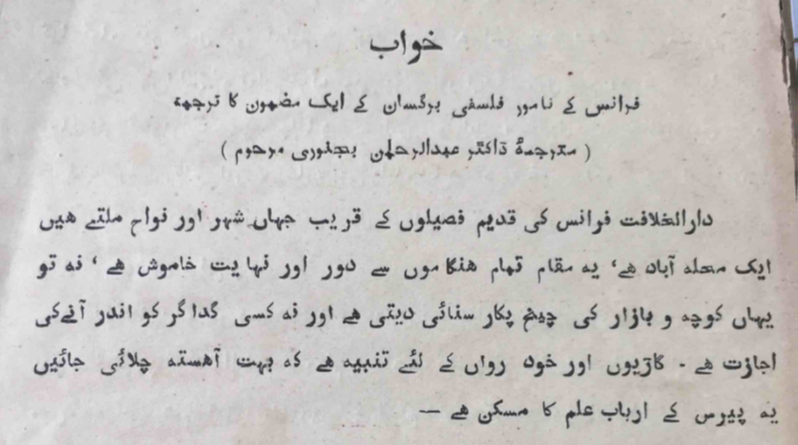
Fig. 3: This is an example of Urdu typography in the linear naskh script. This is a page from the science magazine of the Anjuman-i Taraqqī-yi Urdū.
Many Urdu printers and readers in India were content with lithography. However, some prominent Urdu reformers and Muslim modernists saw lithography as an antiquated technology in contrast to industrial typography. This often exclusionary conflation of type with modernity was influenced by British colonial cultural and education policies.37 A number of these reformers were educated at Aligarh and found employment in the Hyderabad State, such as Maulvi Abdul Haq, the longtime leader of a major Urdu educational and publishing outfit, the Anjuman-i Taraqqī-yi Urdū (the Association for the Advancement of Urdu), that was based in the Hyderabad State in the early 1930s.38 In turn, the publicist for the Anjuman-i Taraqqī-yi Urdū (henceforth the Anjuman), bemoaned that “this litho[graphy] system was a great obstacle in the way of the progress of [the] Urdu press and literature.”39 More pointedly, Ghulam Rabbani, who was also associated with the Anjuman, complained that “today in our country and even more than this, perhaps in the entire world, Urdu is the only such language whose books are published through lithography. Just like for ages our poetry has been caught up in linguistic intricacies, in this same way, we are stuck with nasta‘līq. This is not just the language’s misfortune, but its death.” Invoking the limestone plate used in lithography, Rabbani compared lithography to a “heavy slab of stone” suffocating Urdu.40 As Bar Sadeh observes, some prominent Muslim modernists, “identif[ied] typographic movable print with progress and Muslim unity.”41 More broadly, recent scholarship demonstrates that larger narratives of modernity, nationalism, and religion were embedded in smaller-scale decisions about print design, aesthetics, and publishing technology.42
What is significant here is not only the association of type with modernity, but also the placement of the print trajectory of Urdu in contrast to other script technologies around the global scale.43 As Mullaney observes, type had wide appeal “not only because of its utility as a business appliance but as a symbol of modernity.”44 For anxious Indian Muslim modernists who were buffeted by the challenges of continued British rule, the expansion of English-medium education, and the rise of competing national movements that positioned Muslims as a numerical minority in India, movable type technology came to represent far more than just monetary rewards or industrial speed. In response, the Osmania Type Foundry attempted to craft type technology that was compatible with nasta‘līq and thereby inaugurate a shift away from lithography without losing the nasta‘līq script.45 In summary, the Osmania Type Foundry represented an alternative to either those Urdu printers who were comfortable with lithography or those who viewed nasta‘līq as somehow incompatible with Urdu’s modern needs.
This brings us to the distinctive political space of Hyderabad and how it influenced these type experiments.46 The Hyderabad State, which was ruled by the Āşif jāhī dynasty, emerged as a regional successor state to the Mughal Empire in the early eighteenth century.47 The princely ruler of Hyderabad, the niz̤ām, entered into a treaty relationship with the expanding British Empire in the late eighteenth century. Hyderabad constituted a ‘princely state’, a semi-independent kingdom with significant internal authority over law, taxation, and education. Hyderabad was one of the largest princely states in India and enjoyed significant political power. In particular, Eric Beverley makes a compelling case that Hyderabad demonstrates the significance of “minor sovereignties in an imperialized world” that were not “ephemeral or insignificant” but rather important spaces for “political improvisation and experimentation.”48 Hyderabad also was the largest Indian princely state ruled by a Muslim dynasty, even though the vast majority of its population were Hindu. By the early twentieth century, the seventh niz̤ām of Hyderabad, the princely ruler, was one the wealthiest individuals in the world.
Although Urdu was the official language of the Hyderabad State from the 1880s to 1948, Urdu-speakers constituted only about ten percent of the state’s population. There were also Marathi, Kannada, and Tamil-speaking communities in the state. In focusing on Hyderabad, this article builds on recent scholarship calling for more studies of Urdu in relation to other languages beyond Hindi and to other regions outside of northern India.49 (While it is beyond the scope of this article, it important to acknowledge the possibility that some Urdu language advocates in Hyderabad, particularly those who were educated in northern India, might have viewed the princely state as a bulwark of sorts for Urdu in competition with Hindi.) In terms of the history of Urdu in Hyderabad, scholars have explored the varied efforts to fashion Urdu as a vernacular medium of education, as a ‘Muslim language’ tied to the princely court, or as a vehicle of progressive literature.50 For example, Afsar Mohammad examines “the place of Urdu within the Hyderabadi public sphere.”51 Although Urdu was widely used by Muslim and Hindu communities in the Hyderabad State’s cities, the majority of the princely state’s population were Telugu-speakers in rural districts.52
The Osmania Type Foundry was part of the larger linguistic and educational projects of the Hyderabad State that were associated with Osmania University, which was founded in 1918.53 In her previously mentioned study of Osmania University, Datla illustrates how Urdu educators in Hyderabad from the 1910s to the 1940s fashioned Urdu as “a worldly vernacular that would rival English as a language of business and learned conversation.”54 Urdu became the focus of education reformers in Hyderabad, according to Datla, as the princely state’s government “turn[ed] toward language, not religion, as a means for addressing the deficiencies of British education in colonial India.”55 The educational efforts at Osmania University included large-scale translation projects, the development of scientific and technical terms, and the production of new textbooks.56 And many of the same intellectuals that were involved with the Government Central Press, the parent-organization of the Osmania Type Foundry, were involved with Osmania University.57 Expanding on Datla’s pioneering study, this article examines another facet of Hyderabad’s educational apparatus and multifaceted experimentation with Urdu, type printing. While Datla does not discuss print technologies in detail, she does address adjacent efforts, including proposals for the reform of the Urdu script.58 As she notes, a significant element of these linguistic reform projects was the belief that “the Urdu script needed to be transformed for modern needs.”59
In focusing on Hyderabad, this article does not minimize the impact of North Indian presses and educational institution on Urdu print culture across South Asia and on Hyderabad, in particular.60 (As both Datla and David Lelyveld have discussed, Syed Ross Masud, Syed Ahmad Khan’s grandson and the Director of Public Instruction in the Hyderabad State, provided an important personal and institutional connection between Muslim educational projects at Aligarh in North India and Hyderabad.61 Moreover, many of the Urdu intellectuals who were invested in these overlapping educational and printing projects in Hyderabad, such as Abdul Haq, were themselves from North India.) Rather the Osmania Type Foundry demonstrates how some Urdu printers, intellectuals, and modernists selectively harnessed the history of Hyderabad to make a case for nasta‘līq type (and its connections to older manuscript cultures and other Muslim spaces beyond India.) Said another way, the combination of great wealth, a deep history of Muslim sovereignty in the Deccan, and distance from established Urdu publishing houses in northern India made the Hyderabad State a potent site for experiments with Urdu script technologies.62 To address this more fully, we will now turn to the Osmania Type Foundry’s catalogue.
The Osmania Type Foundry and Its Historical Claims
In 1933 the Osmania Type Foundry published a catalogue of its newly invented fonts of typeface for nasta‘līq, naskh, and suls (which are different forms of the Perso-Arabic script.) As previously mentioned, the Osmania Type Foundry did not constitute the first attempt to craft Urdu type either across South Asia or specifically in Hyderabad. For example, Aziz underlines the significant contributions of Hyderabad to research on type printing in Urdu dating back to the end of the nineteenth century as various officials engaged with printers in Bombay and Calcutta. In 1898, the Hyderabad State established its first committee to develop nasta‘līq type, which resulted in a report detailing the technical challenges.63 And in 1911 the government of Hyderabad explored the possibility of jettisoning lithography for typography in government publications and established a “Type Committee.”64 Aziz suggests that the next endeavor to craft movable type technology for nasta‘līq in Hyderabad coincided with the founding of Osmania University and involved many of the same figures who contributed to establishing the university, such as Sir Akbar Hydari, a prominent government official in Hyderabad who later served as the prime minister of the princely state.65 Ultimately, the princely state mandated that the Government Central Press (dār ul-t̤aba‘ sarkār-i ‘aālá) – the parent organization of the Osmania Type Foundry- should invent movable type technology that was compatible with nasta‘līq.66 The Government Central Press was a major publisher of educational materials in Urdu and English in Hyderabad.67
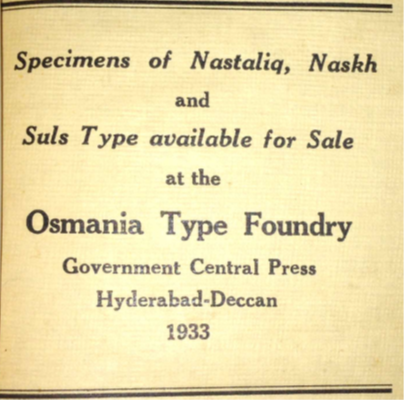
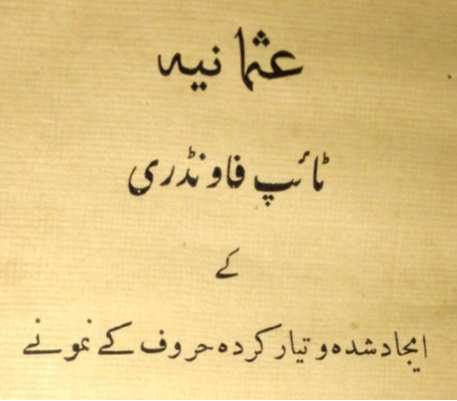
Figs. 4a and 4b: The front and back covers of the catalogue of the Osmania Type Foundry in English and Urdu.
In 1933, the Osmania Type Foundry produced a distinctive typeface (or font family) for the Perso-Arabic script that included fonts of different sizes as detailed in their catalogue.68 The catalogue detailed “the varied beautiful faces of the designed types of the Osmania Type Foundry of Hyderabad.”69 The foundry grouped its fonts under the rubric of a new ‘Osmania’ typeface that was named after the ruling dynasty of Hyderabad.70 While the catalogue included entries in three different versions of the Perso-Arabic script, nasta‘līq, naskh, and suls, most of the entries were for Persian and Urdu in nasta‘līq and naskh. There were fifteen entries in total in the catalogue, of which seven were for nasta‘līq and seven were naskh. Three of the catalogue entries were written in Persian, ten in Urdu, and two in Arabic. The three Osmania fonts of typeface (nasta‘līq, naskh, and suls) included font sizes ranging from 10 to 30 points. Each of these size-based fonts was made up of sorts or individual pieces (what the foundry referred to as ‘ḥarf’ or letters) with each ‘sort’ containing one Urdu letter (or more likely letter combinations.) The Osmania Type Foundry’s letters could then be arranged in a line for typeset printing. Technical details about the different fonts were interspersed with exemplary passages illustrating the different fonts in the catalogue. For example, one entry described the 594 different letters developed for the complete Osmania nasta‘līq set of letters (or sorts.) The set of letters for nasta‘līq type consisted of 457 single letters, 102 compound letters, and 35 extra letters.71
Of particular significance, the Osmania Type Foundry focused on producing nasta‘līq movable type, even when other script styles of Urdu would have been easier to produce in typography since they were more linear. For example, while the set for the nasta‘līq font were prepared and ready for sale in 1933, those for the more linear suls and naskh were listed as ‘under preparation’ even though these versions of the Perso-Arabic script required far fewer letters.72 The Osmania naskh font included 326 letters (or sorts) and the Osmania suls font contained only 258 letters, while the nasta‘līq font consisted of almost 600 different letters.73
Scholarship on Muslim cosmopolitanism in the Indian Ocean world has demonstrated how the ‘interstices’ of modern empires presented political possibilities for Indian Muslims.74 Shifting from the scale of empires to the smaller scale of a princely state, this section provides a close reading of this 1933 catalogue.75 There is little contextual information about the Osmania Type Foundry or the printers and artisans who worked there. Therefore, this article primarily focuses on the content of the 1933 catalogue.76 In her recent study of Urdu newspaper culture, Megan Eaton Robb proposes the “methodological model” of “a granular account” of a lithographic newspaper in order to explore how Urdu informed Indian Muslim political identities.77 In closely reading this 1933 catalogue, this essay takes inspiration from Robb’s method (but operates on the much smaller scale of a case study of one type catalogue.)
Despite some unverifiable claims that the Osmania Type Foundry’s wares were widely used in India (and even shared with the shah of Iran in 1934), the foundry seems to have enjoyed a short life as a boutique press.78 However, it is clear that there was anticipation of the invention of Urdu type in nasta‘līq in Hyderabad in the early 1930s even if additional information on the Osmania Type Foundry itself has proved elusive. For example, a 1931 census report notes that there was significant hope that “lithography will very soon be replaced by movable types and the publications of … [Osmania] University will be printed in the new Osmania Nastaliq (nasta‘līq) type made in the Government Central Press.”79 More broadly, the princely state’s investment in the Osmania Type Foundry spoke to the concerns, which were briefly mentioned in the 1931 census in relation to Osmania University, over “the absence of good books in Urdu.”80 In turn, the 1930 edition of the British and Colonial Printer and Stationer discussed how the Hyderabad State “ha[s] been experimenting with Nastaliq (nasta‘līq) type for seven years” with ongoing expenditure by the princely government to support the endeavor.81
This brings us to the varied historical, political, and religious narratives embedded in the entries in the Osmania Type Foundry’s catalogue. In his recent study of a lithography printing guide, Gianni Sievers attends to both “the material and technical aspects” of printing and the discursive themes of “nationalism, modernization, and social reform.”82 Likewise, the entries in the Osmania Type Foundry’s catalogue suggest that experiments with typography involved competing articulations of modernity not only in comparison to Europe but also in conversation with other languages that used (or formerly used) the Perso-Arabic script. In particular, the foundry framed the Urdu language in relation to both trans-regional reference points and local histories of Muslim sovereignty in India and engaged with the technological choices of printers and publishers in Persian, Arabic, and Turkish in the Middle East. For example, the Osmania Type Foundry drew connections between Islam and script. This is best illustrated by the first example in the catalogue, a short Persian poem for “30 Point Osmania Nasta‘līq,” which is translated below.
I have done research from Ālif, Beh to Yeh [letters in the Arabic alphabet]
But your mystery cannot be revealed.
Each spelled letter is a scroll of secrets
The letters of T̤āhā [a surah of the Qur’ān] are in praise of you.83
This short Persian poem advertised the type products of the Osmania Type Foundry as both mechanical and esoteric and drew connections to the Quran. The foundry certainly was not unique in invoking Islam for its print products within a princely state setting.84 However, as the catalogue progressed, the Osmania Type Foundry interwove references to the wider history of Islam with more localized histories of Muslim sovereignty in India. This is illustrated in a long Persian passage for “24 Point Osmania Nasta‘līq.”
The Persian prose passage for “24 Point Osmania Nasta‘līq” began by extolling the current ruler of Hyderabad, Mir Osman Ali Khan. “In this auspicious era … one of the infinite blessings is that the king, whose majesty is like that of Jamshed [classical Iranian ruler], and who has a heart like the great Persian king Khusrau, is the elevated sultan of the sciences, Nawab Mir Osman Ali Khan Bahadur Asif Jah 7th.” The Osmania Type Foundry then claimed that Hyderabad was “the meadow of science and the garden of arts, where leadership in the promotion of the material and spiritual progress of education and commerce is manifest.”85 The foundry next compared the city of Hyderabad to Baghdad, which had been a center of learning, science, and arts from the eighth century to the thirteenth century. It is worth quoting this passage in full:
The capital city of Hyderabad, like the realm of the Abbasids [i.e. Baghdad], became the harbor of travelling scholars and the direction of the hopes of the scholars of the world; One of the blessings of this august era of the ‘Osmānī [i.e. dynasty of Hyderabad] is the invention and casting of the lead letters of nasta‘līq.86
With the phrase “the lead letters of nasta‘līq,” the Osmania Type Foundry associated the mechanical production of the movable ‘lead letters’ of type with the handwritten terrain of manuscripts. This comparison of early twentieth century Hyderabad to classical Baghdad served both as a rhetorical flourish and to locate these experiments with typography in Hyderabad within an older lineage of Islamic textual production. Like Baghdad of old, early twentieth century Hyderabad was to be a global center of learning.87 In turn, this passage reflects how the niz̤ām’s sovereignty rested on both “his position as a traditional, indigenous ruler” and his patronage of modern education.88 Moreover, this combination of global ambitions and local history reflected wider trends in Urdu print across late colonial India. As Robb notes, many Urdu publications in the early twentieth century invoked Persian’s longer history in India, deployed calligraphic visuals, and exhibited “a burgeoning regional political identity.”89 Likewise, Beverley argues for the importance of regional histories of Muslim sovereignty and connections to other Muslim-ruled states through informal diplomacy in the politics of the Hyderabad State.90
Continuing on, the Osmania Type Foundry posited that its newly minted type letters “in this pleasing form and golden and bejeweled noble robes are offered to the well-wishers of publishing in the East and the lovers of the lead letters of nasta‘līq.”91 Thus, the lead letters of type were wrapped in the terms and themes of Persian verse. In summary, the foundry proposed that both religious advancement and material progress were located in the mechanical lead letters of type. As scholars have noted, the transregional cultural ambitions of the Hyderabad State were both an important element of the state’s politics and ultimately curtailed by its location in the British Empire.92 Although many of the Osmania Type Foundry’s claims were either hyperbolic or aspirational, they fit within the larger goals of the princely dynasty in Hyderabad to assert itself through educational schemes, building projects, and the cultivation of both Abbasid motifs and familial ties to the Ottoman Empire.93
As seen above, the Osmania Type Foundry often relied on the Persian language in the catalogue’s entries. In fact, Persian performed important work for the foundry. Published with the goal of creating a larger audience for Urdu type in India, Persian initially might appear to be an odd marketing choice, given the diminished Persian-reading audience in India by the 1930s.94 Moreover, while both lithography and typography were initially used for printing in Iran, ultimately nasta‘līq via lithography largely was replaced by naskh in typography by the early twentieth century.95 Why did the Osmania Type Foundry utilize Persian to market Urdu type?
A potential answer to this question is provided by the longer history of Persian in the Indian subcontinent. Specifically, the historical memory of Persian seems to have become a useful means for the Osmania Type Foundry to contest the narrow territorial demands of nationalism in the early twentieth century. In the pre-colonial era, Persian had operated as a language of empire in South Asia to incorporate a range of flexible conceptualizations of Islamic law, ethics, and philosophy into a vibrant political culture that connected the Indian subcontinent to Central Asia and the Middle East.96 Persian had been the predominant language of scribal administration, elite education, and poetic composition for Hindu and Muslim nobles in the Mughal Empire and its successor states. (Persian continued to be used in administration in Hyderabad until the 1880s.) Moreover, scholars have addressed the important role of Persian in the fashioning of lithographic printing in India.97 Robb, for example, examines how the use of lithography to publish Urdu newspapers enabled the continuation of Persian aesthetics around calligraphic nast‘alīq.98 It was this earlier transregional reach and cosmopolitan capacity that the Osmania Type Foundry in Hyderabad evoked as the Persian inheritance of Urdu type in the early 1930s.99
This evocation of Persian in Hyderabad suggests subtle differences with Delhi in northern India. In her magisterial study of Delhi’s ashrāf Muslims, Margrit Pernau examines the forging of a new middle class from an older Muslim nobility in part through print technologies and education.100 Crucial to this gradual transformation was the modification of lineage-based respectability into concerns with achievement.101 (And Pernau emphasizes the partial and exclusionary nature of this social transformation.102 ) However, slight differences emerge between Delhi and Hyderabad. Criticism of Indo-Persian culture- and its noble ties and alleged decadence- were central to this process of middle-class formation in Delhi.103 While these themes were certainly present in Hyderabad, the Osmania Type Foundry suggests the enduring importance of lineage and Persian in the princely state. This 1933 catalogue certainly illustrates some of Pernau’s key points, including the emphasis on Muslim history and the importance of education, but it also suggests a continuing connection to Persian. Moreover, this also reflects Beverley’s analysis of the development of a distinctive “modernist patrimonialist statecraft” in Hyderabad in which older models of princely sovereignty “blended with languages of technocratic, rationalist, or modernist political change.”104
Immediately followed this Persian entry, the Osmania Type Foundry shifted geographic and temporal focus to contemporary language reform in Turkey to make the case for Urdu type technology. In the late 1920s and early 1930s, the newly established Republic of Turkey, which replaced the Ottoman Empire in the Anatolian peninsula after World War I, changed the script of the Turkish language from the Ottoman Perso-Arabic script to the Latin script in the effort to create a ‘modern’ national language for the new nation-state.105 Given the political and personal ties between the Hyderabad State and the Ottoman Empire, Urdu intellectuals in Hyderabad watched linguistic developments in the post-Ottoman Republic of Turkey with a mixture of inspiration and trepidation. This next entry in the 1933 catalogue, which was written in Urdu, read:
In Turkey, in the matter of terminology, the establishment of Latin letters in place of Arabic [letters] is a major change. Many people from the previous era still now give preference to the Arabic script in their personal letters and writings, but in official and business writing, for which the new Turkish script is necessary, their mode of practice is this: to prepare the first draft in the Arabic script and then write a version in the Latin script. However, now that the Latin script has been permanently establish for the Turkish language, the younger generations will remain deprived of the treasury of the sciences of the past.106
The transformative impact of the Turkish language reform certainly served as a model for the ambitions of the Osmania Type Foundry to create new kinds of type technology in India. However, in contrast to the direction of the Turkish language reform, which jettisoned Ottoman’s Perso-Arabic script for Latin letters, Urdu type promoters hoped to maintain not only the Perso-Arabic script but also the nasta‘līq style. Tellingly, the foundry celebrated how many older Turkish citizens found ways to avoid the new Latin letters. This evokes what Jabbari has described as the role of “affective attachments” to script in informing how language reformers engaged with print as “technologies of modernization.”107 More broadly, in contrast to the direction of the Turkish language reform, which replaced the Arabic script with Latin letters, these Urdu type promoters hoped to harness the potential of language reform without a change in script.
I would like to dwell for a moment on the final line of this passage, which gets to the heart of the conundrum that the Turkish language reform posed for Urdu intellectuals. Although the script change in Turkey was future-oriented, it had made “the treasury of the sciences of the past” inaccessible to younger generations. In fact, it is possible that the foundry deployed Persian in many of its entries- and emphasized the historical memory of Persian- to assuage these anxieties. It is important to note that these concerns with science, script, and modernity ran throughout the 1933 catalogue beyond this specific discussion of Turkish language reform. For example, the second entry in the catalogue read, “it is an established viewpoint that the development of civilized countries depends on the advancement of sciences and arts and that the only means for the advancement of sciences and arts is really the art of printing – the swift advancement of the knowledge of the West was achieved through printing.”108 Once again, claims to progress were interwoven with the themes of science and print in the catalogue of the Osmania Type Foundry.
Reading these two passages together- the anxiety that a change in script would alienate readers from older forms of knowledge along with the concern that type was necessary for scientific advancement- helps to explain the Osmania Type Foundry’s commitment to producing movable type for nasta‘līq. As previously mentioned, the catalogue served to publicize the industrial and mechanical credentials of Urdu, especially for those who thought that nasta‘līq should be discarded. And a crucial component of this goal was to distance Urdu from lithography (and lithography’s reproduction of handwriting.) Yet while the Osmania Type Foundry certainly sought to distance Urdu from lithography, it simultaneously reinforced Urdu’s connection to handwriting as it framed its efforts in relation to older Persian manuscript cultures and in disagreement with the script choices of Turkish language reformers. To explore this more thoroughly, the final section below will take up the Osmania Type Foundry’s proposal for slight modifications to Urdu’s script along with the perspective of one of its critics and competitors.
The Osmania Type Foundry and Its Critics
As mentioned above, there is limited archival information on the Osmania Type Foundry. Therefore, the foundry’s critics and competitors are an important resource for contextualizing its efforts. One prominent critic was the Hyderabad-based scholar Mirza Rafiq Baig. Baig was involved in overlapping efforts with the Osmania Type Foundry to craft movable type technology for Urdu. In 1929, he wrote an article titled “Nasta‘līq Tā’ip,” for the literary journal, Urdu, which was published by the previously mentioned Urdu educational and literary association, the Anjuman-i Taraqqī-yi Urdū. Some prominent figures in the Anjuman, including its longtime leader Maulvi Abdul Haq, were proponents of typography.109 Published four years before the Osmania Type Foundry’s catalogue was issued, it is possible to read Baig’s 1929 article as directed at the Osmania Type Foundry’s nascent efforts in the late 1920s. More broadly, Baig’s article suggests the broader contours of debates over type in Hyderabad.110
In his 1929 article, Baig was clear on the printing options for Urdu: “today there are usually two established methods of printing- one is the litho[graphy] press and the other is the type press.”111 Baig supported the replacement of lithography with typography, even if he harbored doubts about the viability of ongoing efforts to craft nasta‘līq movable type. Much like the Osmania Type Foundry, he directly connected type to civilizational progress and framed the invention of nasta‘līq type technology as ‘catching up’ to western developments.112 Baig insisted that “if Urdu is to remain alive in the world, then it will only be because its type was created either in Hyderabad or in some other corner of the world … and if type is not created or adopted, then that era is not far off when Urdu will disappear.”113 Somewhat hyperbolically, he claimed that educated Urdu readers were reduced to tears when they compared the printed books of other languages to lithographed Urdu texts.114
Baig argued that there were two overlapping efforts to produce nasta‘līq movable type in the Hyderabad State in the late 1920s, that of the Government Central Press, which was the parent organization of the Osmania Type Foundry, and his own.115 It seems that these experiments in type in Hyderabad extended beyond these two, given the existence of a separate undated catalogue of type wares that was published by the Hyderabad State’s printing department (Sarishtah tabā‘at hokūmat-i Haiderābād.) Titled Namūnah jāt tā’ip, or “Type Samples,” this catalogue included examples of the Osmania typeface alongside other examples of Perso-Arabic typeface.116 However, in contrast to the Osmania Type Foundry’s 1933 catalogue, the four entries in this undated catalogue for “Osmani Script,” or “khat-i ‘osmānī,” were not in nasta‘līq but rather in more linear versions of the Perso-Arabic script.117 While each entry in the Osmania Type Foundry’s catalogue used a different passage in prose or poetry in Urdu, Arabic, or Persian, almost all of the entries in this undated catalogue were the same Urdu prose passage extolling the importance of education in the vernacular.118
Maulvi Abdul Haq was involved in the Government Central Press, and he allowed Baig to participate in the nasta‘līq type experiments in the Government Central Press and to learn “the work of the foundry” there.119 (Baig spent at least ten months at the Government Central Press.120 ) Baig rejected the subsequent criticism that he was either duplicating the efforts of the Government Central Press or revealing their technological secrets.121 Although Baig did not specify the accusations leveled against him, what is clear from his article is that he was part of debates over Urdu print technology in Hyderabad.122 Baig explained his own interest in typography as stemming from his earlier experience in printing an Urdu journal.123 I have characterized Baig as both a critic and competitor of the Osmania Type Foundry given that he described himself as producing a rival design to that of the Government Central Press. However, his 1929 article on nasta‘līq type could also be read as a more general call to action for typography in the Urdu publishing sphere.
Throughout his article, Baig called for a moderate reform of the nasta‘līq script to make it more compatible with movable type.124 He did not want to abandon the script style that had become so associated with the Urdu language since he insisted that “I accept that the nasta‘līq script is the most beautiful script in all the world.”125 Rather, he argued that successful invention of nasta‘līq type technology would enable the “freedom” of Urdu from lithography, as was mentioned at the beginning of this article. To quote this passage in full, “It is fortunate that for some time those of us who are responsible and desire the advancement of Urdu have been trying [to develop type] and want that Urdu would gain freedom (āzādī) from the misfortune of the method of lithography, but this freedom (āzādī) has not yet been achieved.”126 It is worth noting that Baig’s revolutionary refrain for nasta‘līq type in Hyderabad was echoed in a contemporary British publication, the British and Colonial Printer and Stationer, in 1930:
It is certain that Urdu printing in India will undergo a revolution before long. The Nizam’s Government have been experimenting with Nastaliq (nasta‘līq) type for seven years and two kinds have been now evolved and tested by experts.127
While Baig praised the use of naskh type printing for Arabic publishing in the Middle East, he did not advocate for the widespread use of naskh for Urdu. Rather he attributed the limited appeal of naskh type in India to the influence of “the society and culture of Iran” on the “society and culture of India.” According to Baig, “when Urdu was born, then Iran’s favorite script of nasta‘līq also was established for Urdu.”128 Of course, what Baig left unmentioned was the widespread use of naskh type in contemporary Iran, even if lithography had been extensively used earlier.
Baig’s discussion of the state of nasta‘līq type in India leads to the question of labor. While there is little in the Osmania Type Foundry’s catalogue on the workers involved in the foundry, Baig’s article provides a few clues.129 In particular, he placed considerable emphasis on the labor-intensive nature of lithography in arguing that Urdu printers needed to replace lithography with typography. For example, Baig claimed that typography only required the labor of one worker in comparison to the ten workers needed in lithography that still yielded a smaller print run.130 Among the other reasons that he gave for the preferability of typography were the time involved for a scribe to prepare the plate for lithography, the different craftsmen needed for each stage of the lithographic process, and the challenges of making corrections in lithography.131 In summary, Baig was concerned with reducing the number of workers required in printing Urdu texts and speeding up production. It is worth noting that some of Baig’s concerns were echoed in the previously mentioned 1931 census that attributed “errors” and “printing mistakes” in the educational materials published by the Translation Bureau in Hyderabad to the use of lithography.132 However, lithography remained widely used (and presumably cheaper) than type for Urdu since its “equipment required less expertise than that of movable type.”133
Of relevance for the question of labor, Baig underlined the necessity of type for “educational and commercial life.”134 This emphasis on ‘educational and commercial life’ illustrates the ways in which these Urdu type experiments were aligned with the Hyderabad State’s wider political goals and cultural policies. For example, Beverley identifies two major themes in the forging of Hyderabad’s political discourse: an emphasis on the princely state’s “Muslimness … in historical and temporal terms” and its status as a “reforming polity” that sponsored “technological advancement” (italics in the original).135 This claim to commercial and educational advancement on the part of Urdu type reflects these twinned goals. In turn, an emphasis on Islam was certainly shared by the Osmania Type Foundry and other Urdu printers. For example, in her recent book, Amanda Lanzillo addresses how Indian Muslim artisanal communities responded to technological changes. In particular, Lanzillo illustrates how the gradual industrialization of lithography led both to an expansion of the social class of scribes and a growing emphasis on Islam and Muslim scribal pasts that often excluded other kinds of lithographic labor.136 At the same time, some Muslim press owners asserted a claimed shared Muslim identity to undermine demands for higher wages and strikes by Muslim scribes.137 While the lithographic presses that Lanzillo studies are distinct from the Osmania Type Foundry, it is not difficult to imagine that the foundry also deployed similar claims to a shared scribal past and appeals to Islam given the thematic content of its catalogue that was discussed above.
The question of labor (and class) brings us to the anticipated reception of the Osmania Type Foundry’s movable type products. It is likely that this 1933 type catalogue was aimed at a larger audience than just printers themselves since as Sievers explains, “writing Urdu instructional books on technical subjects” was part of “modernizing efforts” that included broader themes of “technological and scientific progress.”138 The anticipated audience for the Osmania Type Foundry’s catalogue would have included both potential customers in Urdu presses across India and readers interested in the princely state’s modernizing projects. Therefore, at the back of the catalogue, the foundry listed (both in Urdu and English) the size, weight, and price per pound of each font.139 Further clues are found in the narrative of the catalogue itself. Addressing its customers, the Osmania Type Foundry foreswore commercial gain: “You should know that this type production and tremendous efforts and valuable investment are not connected to any commercial goals … rather its sole goal is that the Urdu language … will be safe from opposition and will continue to advance to new heights on the wide road of progress.”140 In turn, the foundry insisted that even though the prices were already inexpensive, it was willing to sell its typeface for half-price to reach a wider audience.141 The foundry sold the letters by pound with each pound costing 1.5 rupees, which would have come to 300 rupees for a complete set of Osmania Nasta‘līq that weighed 200 lbs.142 Thus, the Osmania Type Foundry simultaneously hoped for a wide audience for its type wares- and was willing to reduce the price to gain it- and foreswore commercial gain in favor of service to the Urdu language. These conflicting goals suggest that its audience included both officials in the Hyderabad State’s government (and its educational outfits) and Muslim modernists and language reformers concerned with ‘progress.’
A crucial element in the reception of these varied type products in Hyderabad was their aesthetics, particularly their proximity to the calligraphic hand. In a recent special issue, “Beyond Colonial Rupture,” Nur Sobers-Khan, Layli Uddin, and Priyanka Basu address “continuities and changes” in Muslim textual cultures in South Asia.143 In the introduction, they pose the compelling question, “What aesthetic and typographical choices were being made, in terms of lithography versus movable print?”144 One interesting answer is found in these type experiments in Hyderabad.
As previously mentioned, Baig had spent time in the Government Central Press (the parent organization of the Osmania Type Foundry) as its fonts were being developed. However, he was critical of its efforts and considered its products as neither workable nor attractive. In fact, at multiple points he conceded that all of the attempts to craft nasta‘līq type were “strange things” that were “extremely ugly” and “useless.”145 Baig did not just criticize the Government Central Press, but admitted that his own type experiments were unattractive too, or in his own words, “the letters were awful, no, they were truly awful.” Ultimately, in Baig’s telling, both he and the Government Central Press had produced separate nasta‘līq typefaces that were different in style, but equally unattractive.146 As a result, the Hyderabad government set-up a review committee in 1929 that recommended that both Baig and the Government Central Press be given another year to fix the problems in their nasta‘līq fonts.147 Baig insisted that competition was actually preferable for the Urdu-reading public.148 So what exactly were the challenges that the Government Central Press experienced that made its products ‘ugly’ and ‘useless,’ in Baig’s assessment?
The Osmania Type Foundry’s expanded characters provide a possible answer. At the heart of the technical challenge for producing nasta‘līq typeface were compound (murakkab) letters and expanded characters that could approximate the handwritten word. The challenge of compound letters, which are the connected form that two letters from the Perso-Arabic script take when they are next to each other in a word, was shared by all forms of the script. However, expanded characters- with elongated lines and a diagonal tilt- constituted more of a specific challenge for nasta‘līq. In his longer history of Urdu type, Aziz discusses an undated pamphlet from the Hyderabad government that summarized these challenges. This pamphlet from Hyderabad acknowledged that the demands of typography and those of handwritten calligraphy conflicted, especially in terms of adapting the circles, curves, and non-linear tilt of nasta‘līq handwriting to the linear necessities of typeface.149 In turn, in his 1929 article Baig appealed to Urdu printers to make some modifications to nasta‘līq to make it suitable for type. In his own words, “if you can make some reforms in accordance with the demands of ease, then please get started” so that “beauty would remain and the demands of type could also be fully achieved.”150 One attempted modification of nasta‘līq for type was the Osmania Type Foundry’s “expanded characters” for “24 pt. Osmania Nasta‘līq” that is show in a Persian poem below.

Fig. 5: “24 pt. Osmania Nasta‘līq: Persian Poetry with Expanded Characters.”
In many ways, these “expanded characters” got to the heart of the technical challenge of producing nasta‘līq typography since they were crucial for approximating the diagonal slant of handwritten calligraphy in movable type. In this entry, the Osmania Type Foundry quoted a short excerpt from Muhammad Iqbal’s poem the Jāvid Nāmah (Book of Eternity.) The Jāvid Nāmah had been published the year before and was a re-interpretation of Dante’s Divine Comedy with the poet Rumi guiding Iqbal through the heavens and encounters with prominent historical and literary figures.151 While the Osmania Type Foundry did not explain why it selected this poem, one possibility is that the many repeated words showcased the expanded characters- the curving lines and non-linear tilt- that were crucial for the foundry’s claim that it had cast viable type for nasta‘līq.152 The repeated phrases in this poem included “face to face” and “house to house, door to door, ally by ally, street by street,” among others. For example, the fourth line read “From house to house, door to door, ally by ally, street by street (khānah be khānah dar ba dar kocheh be kocheh ko be ko).”153 In this line, the repetition of the word ‘kocheh’ (ally) demonstrated the elongated form of the letter che چ. It was precisely the elongated lines and tilt of handwritten nasta‘līq that the foundry sought to approximate in its typeface. Thus, through its selection of this Persian poem, the Osmania Type Foundry demonstrated its technical capacity to replicate certain configurations.
Of particular significance for our argument here, not only did the Osmania Type Foundry use Persian to make the historical case for ‘the lead letters of nasta‘līq,’ as discussed in the previous section, but it also deployed recently written Indo-Persian verse to demonstrate typography’s ability to approximate calligraphy’s slanting lines. These efforts to resemble handwriting in type suggest what Mullaney terms the ‘strangeness’ of ‘continuity’ in print culture in which “continuity is strange because … it is in no way synonymous with conservatism. To continue something … can be avant-garde, iconoclastic, radical, and even destructive.”154 Alongside the Osmania Type Foundry’s polemical embrace of type as a distinctly modern technology, it also drew attention to the very thing that made Urdu such a challenge for type technology, handwriting. In this way, this Hyderabad-based foundry underlined the connection between Urdu and handwriting even in the very act of attempting to displace it. Said another way, the Osmania Type Foundry’s expanded characters illustrate how the foundry blurred the boundary between handwritten script culture and print culture for typography in ways that echo how it was blurred for lithography. In summary, the Osmania Type Foundry’s experiment with expanded characters suggests how the very components of letters in Urdu’s script became important sites for technological experimentation.
This brings us back to the question of the ‘aesthetic choices’ between lithography and type.155 While the Osmania Type Foundry did not challenge the linking of typography with modernity, it did challenge the assumption that non-linear nasta‘līq was incompatible with typographic modernity. Moreover, in the very act of attempting to technologically displace the role of handwriting in lithographic printing by crafting movable type technology, the foundry foregrounded the importance of handwriting to Urdu. In his recent article, Bar Sadeh carefully analyzes how the choice of either typography or lithography constituted an aesthetic and political choice in India.156 In particular, he argues that the printing of an Arabic text in lithography- rather than typography was “an attempt to integrate … [its] message into the aesthetic world of Urdu print.”157 In turn, the catalogue of the Osmania Type Foundry reveals the effort to integrate typography itself into the lithographic aesthetics associated with the Urdu language.
I would now like to conclude with the enduring technical challenges of nasta‘līq typography in Hyderabad and elsewhere. These challenges are reflected in Aziz’s longer history of Urdu type. As he notes, the large number of different font sorts (letters) needed for a complete typeset, the impossibility of rendering some slanting Urdu words in linear type, and the enduring challenge of crafting movable type letters that could approximate handwritten calligraphy resulted in the government of Hyderabad concluding that the production of usable nasta‘līq type was not possible in 1931.158 Clearly this was not the end of the Osmania Type Foundry’s efforts since the catalogue was published two years later in 1933, but it does suggest that the Osmania Type Foundry’s experiments were accompanied by concerns over technological failure.
A significant challenge to the Osmania Type Foundry’s commercial success was the large number of separate lead letters (or sorts) that were required to render the multiple possible configurations of each Urdu letter. Further complicating the matter was that the listed 594 letters of Osmania nasta‘līq only included commonly used letters and configurations. The foundry admitted that an additional 216 less commonly used letter combinations would be required for a complete set, bringing the actual total to 810, which was almost three times the number of letters for the naskh and suls typeface fonts.159 For most small-scale Urdu printers in the 1930s, the Osmania Type Foundry’s typeset for nasta‘līq probably would have seemed impractical not only in comparison to the much smaller (and more affordable) naskh typeset, but also in competition with lithography, which remained affordable, available, and widely used.160 Moreover, as Baig conceded, many Urdu readers were probably not all that invested in these debates over the advisability of lithography or typography for Urdu. He noted that “in my opinion, the issue of the need for type is in the mind of probably no more than 30 % of the Urdu-knowing Indian public.”161 In other words, movable type played a more important role in discussions over history, global ties, and what modernity meant for Urdu printers and intellectuals than in the actual production of texts.
Conclusion
Just as the Osmania Type Foundry anticipated that its type products would launch a veritable print ‘revolution,’ Mirza Rafiq Baig hoped that type would bring Urdu ‘freedom’ and liberate the language from lithography. While neither of these aims came to pass in the 1930s, revisiting the history of the Osmania Type Foundry brings to the fore the importance of debates over Urdu’s script style and print technologies. There certainly were quixotic elements in the Osmania Type Foundry’s extended experiments with nasta‘līq movable type printing. Placed alongside the niz̤ām’s Abbasid- inspired building projects, the foundry could be understood not as a major commercial enterprise but rather as a boutique press that aimed to project the princely power of Hyderabad. Whatever these practical limitations, with the casting of nasta‘līq movable type, the Osmania Type Foundry did aim to publicly prove the industrial nature and mechanical qualifications of Urdu. In this vein, the Osmania Type Foundry represents an effort in the early 1930s to present the princely state of Hyderabad as a new center for Muslim knowledge production and technological innovation. In contrast to Urdu language reformers who contemplated discarding nasta‘līq along with lithography, the Osmania Type Foundry attempted to craft type technology that was compatible with nasta‘līq’s non-linear style. More broadly, their efforts illustrate how some Indian Muslim intellectuals and language reformers conceptualized the Urdu language beyond the contentious Hindi-Urdu conflict in northern India and in comparison to the technological trajectories of other languages outside of South Asia. Specifically in the Hyderabad State, the letters of Urdu’s slanting form of the Perso-Arabic script, nasta‘līq, became the site of technological experimentation, debates over different script technologies, and articulations of both transregional connections and local Muslim sovereignty.
The Hyderabad State was named after its capital city, Hyderabad. ↩
Specimens of Nasta‘līq, Naskh and Suls Type available for Sale at the Osmania Type Foundry (Hyderabad: Government Central Press, 1933), 10. The title of the catalogue was rendered in both English and Urdu. The Urdu title was ‘Osmānīyah tā’ip fāūnḍrī ke āejād shudah aur tiyār kardah ḥarūf ke namūnah (Examples of the Invented and Prepared Letters of the Osmania Type Foundry.) I have rendered both the catalogue’s title and the type foundry’s name in the English version, “Osmania Type Foundry,” for ease of reading. ↩
Mirza Rafiq Baig, “Nasta‘līq tā’ip,” Urdu (January 1929): 93. ↩
See Miles Ogborn, Indian Ink: Script and Print in the Making of the English East India Company (Chicago: University of Chicago Press, 2007) and Ulrike Stark, An Empire of Books: The Naval Kishore Press and the Diffusion of the Printed Word in Colonial India (Ranikhet: Permanent Black, 2008.) As Geoffrey Roper notes, there were sporadic efforts in India starting at the end of the eighteenth century which were ultimately expanded upon by the Hyderabad State. [Geoffrey Roper, “The History of the Book in the Muslim World,” in The Oxford Companion to the Book, ed. Michael F. Saurez and H. R. Woudhuysen (New York: Oxford University Press, 2010), 545.] ↩
Farzan Kermaninejad briefly discusses the limited success of efforts in Hyderabad- and elsewhere in India- to produce nasta‘līq type due to the thousands of required letters. (Farzan Kermaninejad, “Usage of Nasta‘līq in the Modern Publications,” Typography Day 2012: Typography in Publication Design (2012), 7-8. ↩
Thomas Mullaney, The Chinese Typewriter: A History (MIT Press, 2017), 26. ↩
Similarly, while discussing the brief life of another print technology with limited use, the Urdu typewriter, Charlotte Giles and Megan Eaton Robb observed that the Urdu typewriter constituted “an important part of the lifecycle of Urdu printing,” even if its use was relatively limited. [Charlotte Giles and Megan Eaton Robb, “Highlighting the Treasures of the Naqvi Collection: A Typewritten Urdu Translation of Wajid ‘Ali Shah’s Reply to the Blue Book,” Library of Congress Blogs (August 24, 2021.)] ↩
For scholarship on Hindi language and nationalism, see Francesca Orsini, The Hindi Public Sphere 1920-1940: Language and Literature in the Age of Nationalism (New York: Oxford University Press, 2002). ↩
Amrit Rai, A House Divided: The Origin and Development of Hindi-Urdu (Delhi: Oxford University Press, 1984) and Christopher King, One Language, Two Scripts: The Hindi Movement in Nineteenth Century North India (Bombay: Oxford University Press, 1994). ↩
For a short selection of important scholarship on Urdu print cultures, see Stark, An Empire of Books, Jennifer Dubrow, Cosmopolitan Dreams: The Making of Modern Urdu Literary Culture in Colonial South Asia (Honolulu: University of Hawaii Press, 2018), and Megan Eaton Robb, Print and the Urdu Public: Muslims, Newspapers and Urban Life in Colonial India (New York: Oxford University Press, 2021). ↩
For example, see Kavita Datla, The Language of Secular Islam: Urdu Nationalism and Colonial India (Honolulu: University of Hawai’i Press, 2013) and Alexander Jabbari, The Making of Persianate Modernity: Language and Literary History between Iran and India (New York: Cambridge University Press, 2023). ↩
Datla, The Language of Secular Islam, 6 and 106. ↩
Datla, The Language of Secular Islam, 10. ↩
Datla, The Language of Secular Islam, 58. ↩
David Arnold, Everyday Technology: Machines and the Making of India’s Modernity (Chicago: University of Chicago Press, 2013), 10. ↩
This echoes the anxieties of Chinese printers over typography as “a civilizational trial by which to judge … whether Chinesescript was compatible with Modernity with a capital M” (Mullaney, The Chinese Typewriter, 10). ↩
Jabbari, The Making of Persianate Modernity, 141-180. ↩
Jabbari, The Making of Persianate Modernity, 179-180. ↩
Scholars have demonstrated that most Urdu books and newspapers were published in nasta‘līq through lithography, while a small component of Urdu publishing was in the more linear naskh style of the Perso-Arabic script in typography (Robb, “Urdu Lithography as a Muslim Technology,” 90-116). ↩
Scholars have emphasized the significant continuity of the calligraphic style of Urdu’s nasta‘līq script from manuscript cultures to print cultures as well as the role of lithographic technology in shaping these continuities. (Stark, An Empire of Books, 44-47 and Amanda Lanzillo, Pious Labor: Islam, Artisanship, and Technology in Colonial India (Berkeley: University of California Press, 2023), 23-24.) As Stark observes, Urdu printed texts in “lithography drew much of its cultural authority from its visible proximity to the manuscript tradition” and “provided an important visual link between the lithographed book and the manuscript” (46-47). ↩
Jabbari, The Making of Persianate Modernity, 148. ↩
Stark, An Empire of Books, 184-187. ↩
Stark, An Empire of Books, 45-49. For a compelling discussion of the continuities between regional manuscript practices and Urdu lithography, see Nur Sobers-Khan, Layli Uddin, and Priyanka Basu, “Beyond Colonial Rupture: Print Culture and the Emergence of Muslim Modernity in Nineteenth-Century South Asia,” International Journal of Islam in Asia, 3, no. 1-2 (2023), 7-8. ↩
Jabbari, The Making of Persianate Modernity, 146. ↩
Jabbari, The Making of Persianate Modernity, 150. ↩
Baig, “Nasta‘līq tā’ip,” 92-98. ↩
Tariq Aziz, Urdū rasm al-khat̤ aur tā’ip (Islamabad: Muqtadirah qaumī zubān, 1987), 189-319. ↩
Jabbari, The Making of Persianate Modernity, 150-152. As Jabbari compellingly puts it, while nasta‘līq might be “one option among others for contemporary Iranians … [it] symbolizes an entire writing system and set of aesthetic values for South Asians” (Jabbari, The Making of Persianate Modernity, 151). ↩
Roper, “The History of the Book in the Muslim World,” 545-548. Roper notes that in addition to India, lithography was used to some degree in Morocco, Iran, and parts of Southeast Asia. For a brief discussion of the simultaneous use of typography in Egypt and of lithography for Urdu in India in the early twentieth century, see Sadeh, “Printing Islamic Modernism: Arabic Texts for Arab and South Asian Muslims in the Early Twentieth Century,” International Journal of Islam in Asia, 3, no. 1-2 (2023),54-56. ↩
For a concise summary of the history of nasta‘līq in Iran and India across both manuscript and print textual production, see Jabbari, The Making of Persianate Modernity, 146-153. ↩
For scholarship on the technological trajectories of Chinese print culture, see Mullaney, The Chinese Typewriter and Christopher Reed, Gutenberg in Shanghai: Chinese Print Capitalism, 1876-1937 (Chicago: University of Chicago Press, 2004.) For the early history of Persian type printing in Iran, Nile compellingly proposed a shift to a global industrial context. He makes the case that early type printing in Iran should be seen as part of global developments in the wake of the industrial revolution and the rise of the iron handpress in the early nineteenth century (and before the arrival and widespread use of lithography in the 1830s.) (Nile Green, “Persian Print and the Stanhope Revolution: Industrialization, Evangelicalism, and the Birth of Printing,” Comparative Studies of South Asia, Africa and the Middle East 30, no. 3 (2010), 474, 479, and 488-490.) A crucial element of Green’s analysis is “the contemporaneity of Iranian printing with corresponding developments on other parts of the planet at the same time” (Green, “Persian Print and the Stanhope Revolution,” 490). ↩
Sadeh, “Printing Islamic Modernism,” 49. ↩
Jabbari, The Making of Persianate Modernity, 148. ↩
Scholars have explored the shifting and contingent relationship of Persian publishing in Iran to lithography and typography. See Green, “Persian Print and the Stanhope Revolution,” 474, 479, and 488-490. ↩
Lanzillo, Pious Labor, 37-38. ↩
Roper, “The History of the Book in the Muslim World,” 545-548. ↩
Stark, An Empire of Books, 23-28. ↩
Datla, The Language of Secular Islam, 106-129. When transliterating the name of the language (Urdu), I have rendered it as Urdū following the Library of Congress transliteration guide. In all other cases, I have rendered the name of the language as ‘Urdu’ as it is commonly used in English. ↩
Choudhri Rahm Ali al-Hashmi, All India Anjuman-e-Taraqqi-e-Urdu: Brief History and Work (Delhi: Anjuman-i Taraqqī-yi Urdū, 1943), 24. Since this text was published in English, I have rendered both the author’s name and the Anjuman’s name as they were given in English rather than transliterating from Urdu. ↩
Ghulam Rabbani, Anjuman-i Taraqqī-yi Urdū kī kahānī (Delhi: Anjuman-i Taraqqī-yi Urdū Hind, 1939), 33-34. ↩
Sadeh, “Printing Islamic Modernism,” 54. ↩
In a recent article, Gianni Sievers addresses different understandings of modernity, technological progress, and education in an influential guide to lithographic printing in Urdu [Gianni Sievers, “Learning How to Print in Colonial North India: The Nizami Press in Badaun and the First Urdu Manual on the Art of Lithography,” Philological Encounters 8, no. 1 (March 2023): 73-109.] In turn, in her nuanced analysis of a lithographic Urdu newspaper, Megan Eaton Robb argues that the distinctive space of its place of publication, the small-town Muslim qasbah in northern India, enabled writers, printers and readers to “engage[] with local, national, and international issues” (Robb, Print and the Urdu Public, 2.) For a compelling analysis of the social and literary space of the North Indian qasbah, see M. Raisur Rahman, Locale, Everyday Islam, and Modernity: Qasbah Towns and Muslim Life in Colonial India (New Delhi: Oxford University Press, 2015). ↩
For the ways in which other Indian Muslim intellectuals critiqued lithography and advocated for type in the Urdu sphere, see Sadeh, “Printing Islamic Modernism,” 54-55. ↩
Mullaney, The Chinese Typewriter, 124. ↩
Aziz, Urdū rasm al-khat̤ aur tā’ip, 223-224. David Arnold discusses the important role of princely states in funding Indian language print technologies, such as the non-Roman typewriter (Arnold, Everyday Technology, 110). ↩
For a nuanced analysis of the Hyderabad State’s sovereignty, see Eric Beverley, Hyderabad, British India, and the World: Muslim Networks and Minor Sovereignty, c. 1850-1950 (New York: Cambridge University Press, 2015. In turn, Amanda Lanzillo illustrates how lithographic aesthetics were important to how some princely states made political claims and cultivated audiences. Of relevance for the argument here, she encourages future scholarship on “the intersection of print design and local ideological and social claims” in the Hyderabad State (Amanda Lanzillo, “Printing princely modernity: Lithographic design in Muslim-Ruled Princely States,” South Asian Popular Culture 16, no. 2-3 (2018): 251). ↩
For a short selection of scholarship on the Hyderabad State, see Datla, The Language of Secular Islam, Karen Leonard, Hyderabad and Hyderabadis (New Delhi: Manohar Publishers, 2014), and Beverley, Hyderabad, British India, and the World. ↩
Beverley, Hyderabad, British India, and the World, 2-3. ↩
Afsar Mohammad, Remaking History: 1948 Police Action and the Muslims of Hyderabad (New York: Cambridge University Press, 2023), 191, 196, 227, and 230-231. ↩
Mohammad, Remaking History, 208-209 and 227. ↩
Mohammad, Remaking History, 212. ↩
For a longer history of Muslim textual production in the Deccan, see Nile Green, Indian Sufism since the Seventeenth Century: Saints, Books, and Empires in the Muslim Deccan (New York: Routledge, 2006). ↩
For the definitive study of Osmania University and its Urdu educational projects, see Datla, The Language of Secular Islam and Kavita Datla, “A worldly vernacular: Urdu at Osmania University.” Modern Asian Studies 43, no. 5 (2009). These extensive experiments in Urdu education, translation, and publishing in Hyderabad built upon earlier printing projects in Aligarh, particularly associated with Sayyid Ahmad Khan as well as the example of education in Japan (David Lelyveld, “The Osmania University Translation Bureau: A Brief Account,” in Osmania University Diamond Jubilee Souvenir (Hyderabad: Osmania University Press, 1979), 17-21). ↩
Datla, The Language of Secular Islam, 58. ↩
Datla, The Language of Secular Islam, 31. ↩
Datla, The Language of Secular Islam, 68-81. ↩
This is particularly illustrated by Maulvi Abdul Haq, a prominent Urdu educationalist, lexicographer, and literary historian who played an important role in educational and printing projects in Hyderabad. For more on the multifaceted career of Abdul Haq, see Lelyveld, “The Osmania University Translation Bureau,” 19-20, Datla, The Language of Secular Islam, 56- 68 and 106-129, and Andrew Amstutz, “A Partitioned Library: Changing Collecting Priorities and Imagined Futures in a Divided Urdu Library, 1947-49” South Asia: Journal of South Asian Studies 43, no. 3 (2020): 505-521. ↩
Datla, The Language of Secular Islam, 117-118. For a discussion of the role of orthography in Persian and Urdu language reform movements, see Jabbari, The Making of Persianate Modernity, 153-164. ↩
Datla, The Language of Secular Islam, 117. ↩
For scholarship on the relationship of Indian Muslim provincial spaces to a changing ‘center’ see Ayesha Jalal, Self and Sovereignty: Individual and Community in South Asian Islam Since 1850 (New York: Routledge, 2000), 185. ↩
Lelyveld, “The Osmania University Translation Bureau,” 18-19, and Datla, The Language of Secular Islam, 59-68. ↩
More broadly, the history of Hyderabad reveals distinctive perspectives on Urdu and modernity. As Datla observed, “there has always been more than one story of Urdu, more than one imagination of its past and its projects in the present and future” (Datla, The Language of Secular Islam, 81). ↩
Aziz, Urdū rasm al-khat̤ aur tā’ip, 217-224. ↩
Baig, “Nasta‘līq Tā’ip,” 97 and 109. ↩
Aziz, Urdū rasm al-khat̤ aur tā’ip, 223-224. ↩
Baig, “Nasta‘līq Tā’ip,” 98. ↩
This rendering of dār ul-t̤aba‘ sarkār-i ‘aālá as “Government Central Press” is found on the cover of the Osmania Type Foundry’s 1933 catalogue. ↩
While Aziz mentioned the Osmania Type Foundry, he did not discuss it at length in his study of Urdu typography. (Aziz, Urdū rasm al-khat̤ aur tā’ip, 223-231.) Aziz did note that the Osmania Type Foundry’s parent organization, the Government Central Press, had more success producing type fonts for other versions of the Perso-Arabic script, including naskh, as did other printers in the Hyderabad State (Aziz, Urdū rasm al-khat̤ aur tā’ip, 231-261). ↩
Osmania Type Foundry, 1. ↩
Osmania Type Foundry, 17 and 22-23. ↩
Osmania Type Foundry, 6 and 19-20. ↩
Osmania Type Foundry, 23. ↩
Osmania Type Foundry, 12-20. ↩
For important work on Muslim cosmopolitanism, see Seema Alavi, Muslim Cosmopolitanism in the Age of Empire (Cambridge: Harvard University Press, 2015) and Nile Green, Bombay Islam: The Religious Economy of the West Indian Ocean, 1840-1915 (New York: Cambridge University Press, 2011). ↩
The Āṣif Jāhī royal family of the Hyderabad niz̤āms cultivated ties with the Ottoman ruling family. As Beverley demonstrates, despite the prohibition on formal diplomacy for princely states in British India, Hyderabad utilized personal and intellectual ties to connect to the Ottoman Empire and global circuits of ‘Muslim internationalism’ in the early twentieth century (Beverley, Hyderabad, British India, and the World, 101-102 and 121). ↩
For a discussion of the range of different workers involved in the industrialization of lithographic printing, see Lanzillo, Pious Labor, 32-34. Lanzillo carefully follows the “shifting relationships between social status, religion, and technological knowledge” in response to the industrialization of lithography in India (Lanzillo, Pious Labor, 24). ↩
Robb, Print and the Urdu Public, 13. ↩
A review of available copies of Hindustan Yearbook did not yield any additional information on the Osmania Type Foundry or its workers. Likewise, I was not able to find additional materials on the Osmania Type Foundry on the rekhta.org digital repository. ↩
H. Ansari, “The Osmania University,” in Census of India, 1931, v. 23, H.E.H. the Nizam’s Dominions (Hyderabad State), Part I. by Gulam Ahmed Khan (Hyderabad-Deccan: Government Central Press, 1933), 218. I would like to the thank the anonymous reviewer for drawing my attention to this helpful source. ↩
Ansari, “The Osmania University,” 217. ↩
“New Nastaliq Type Evolved (From our Indian Correspondent),” in British and Colonial Printer and Stationer, v. 107 (1930), 690. I would like to the thank the anonymous reviewer for also drawing my attention to this source. Nasta‘līq is not transliterated here since it is rendered this way in English in the title. ↩
Sievers, “Learning How to Print in Colonial North India,” 73. ↩
Osmania Type Foundry, 2. ↩
See Lanzillo, “Printing princely modernity,” 247 and 250. ↩
Osmania Type Foundry, 9. ↩
Osmania Type Foundry, 9-10. ↩
This representation of Hyderabad in the Osmania Type Foundry catalogue was part of the wider self-fashioning by Hyderabad’s ruler as global Muslim leaders through references to the classical past, including the use of Abbasid architectural themes. See Guy Attewell, Refiguring Unani Tibb: Plural Healing in Late Colonial India (Hyderabad: Orient Longman, 2017), 124-125. ↩
Datla, The Language of Secular Islam, 50. ↩
Robb, Print and the Urdu Public, 10. ↩
Beverley, Hyderabad, British India, and the World, 1, 10, and 306. ↩
Osmania Type Foundry, 10. ↩
Lelyveld, “The Osmania University Translation Bureau,” 18-19 and Beverley, Hyderabad, British India, and the World. ↩
Beverley, Hyderabad, British India, and the World and Attewell, Refiguring Unani Tibb. ↩
For a compelling account of the role of different languages in projects of Islamic modernism in South Asia, see Sadeh, “Printing Islamic Modernism.” In particular, Sadeh analyzes the role of Arabic in forging “transregional Islamic solidarities” for some South Asian Muslim intellectuals (Sadeh, “Printing Islamic Modernism,” 47). ↩
Jabbari, The Making of Persianate Modernity, 149-150. ↩
Muzaffar Alam, The Languages of Political Islam in India: c. 1200-1800 (Delhi: Permanent Black, 2004) and Rajeev Kinra, Writing Self, Writing Empire: Chandar Bhan Brahman and the Cultural World of the Indo-Persian State Secretary (Oakland, California: University of California Press, 2015). ↩
See Robb, Print and the Urdu Public, 90-93 and 98 and Lanzillo, Pious Labor, 27. ↩
Robb, Print and the Urdu Public, 98. ↩
For a discussion of different perspectives on an imaged Persian inheritance for the Urdu language, see Maryam Fatima and Andrew Amstutz, “Fashioning a Persianate Offspring for a Modern India: Urdu Visions of Persian Pasts, 1890s-1950s,” Philological Encounters 8, no. 2-3 (2023), 176-205. ↩
Margrit Pernau, Ashraf into Middle Classes: Muslims in Nineteenth-Century Delhi (Delhi: Oxford University Press, 2013), xii-xiii, 297-298, and 424-425. ↩
Pernau, Ashraf into Middle Classes, 241, 264-265, 297-298, and 425. ↩
Pernau, Ashraf into Middle Classes, 428. ↩
Pernau, Ashraf into Middle Classes, 260-261. ↩
Beverley, Hyderabad, British India, and the World, 2 and 7. Beverley argues that Hyderabad developed a distinctive “patrimonial modernity” in which the princely state both revived older ethical forms of personalized ‘patrimonial’ sovereignty and drew on a range of modern “technocratic” tools to forge a form of Muslim modernity beyond European colonialism (Beverley, Hyderabad, British India, and the World,1, 3, 7, 133, and 248). ↩
For more on the Turkish language reform, see Geoffrey Lewis, The Turkish Language Reform: A Catastrophic Success (Oxford: Oxford University Press, 1999). ↩
Osmania Type Foundry, 11. ↩
Jabbari, The Making of Persianate Modernity, 144. ↩
Osmania Type Foundry, 3. ↩
For more on the history of the Anjuman, see Datla, The Language of Secular Islam, 106-129 and Amstutz, “A Partitioned Library,” 505-521. ↩
Baig, “Nasta‘līq tā’ip,” 93-98. ↩
Baig, “Nasta‘līq tā’ip,” 85. ↩
Baig, “Nasta‘līq tā’ip,” 85. ↩
Baig, “Nasta‘līq tā’ip,” 84. ↩
Baig, “Nasta‘līq tā’ip,” 84. ↩
Baig, “Nasta‘līq tā’ip,” 97 and 109. Although Baig did not mention the type efforts of the Osmania Type Foundry but rather those of the Government Central Press in his article, presumably they are the same since the Government Central Press was the parent organization of the Osmania Type Foundry. ↩
I would like to thank Borna Izadpanah for kindly drawing my attention to this undated type catalogue that was also produced in Hyderabad, Namūnah jāt tā’ip. This catalogue was published by the Sarishtah tabā‘at hokūmat-i Haiderābād, and it is available at rekhta.org: https://www.rekhta.org/ebooks/namoona-jat-type-ebooks?lang=ur. This undated type catalogue included 14, 18, 24, and 30 point nasta‘līq, 10, 12, 16, 20, and 24 point naskh, 24 point suls, 14 and 30 point majeedi, and 16 and 18 point naskh (mono type) alongside 10, 12, and 18 point Osmani script (khat-i ‘osmānī.) See Namūnah jāt tā’ip, Hyderabad: Sarishtah tabā‘at hokumat-i Haiderābād (undated). ↩
Namūnah jāt tā’ip, 12-14 and 19. ↩
Namūnah jāt tā’ip, 1-18. However, the final three entries in this catalogue were selections of well-known poems by Muhammad Iqbal (Namūnah jāt tā’ip, 19-21). ↩
Baig, “Nasta‘līq tā’ip,” 98 and 104-105. ↩
Baig, “Nasta‘līq tā’ip,” 109. ↩
Baig, “Nasta‘līq tā’ip,” 104-105. ↩
Baig, “Nasta‘līq tā’ip,” 105. ↩
Baig, “Nasta‘līq tā’ip,” 69 and 103. ↩
Baig, “Nasta‘līq tā’ip,” 83-85. ↩
Baig, “Nasta‘līq tā’ip,” 85. ↩
Baig, “Nasta‘līq tā’ip,” 92-93. ↩
“New Nastaliq Type Evolved,” 690. ↩
Baig, “Nasta‘līq tā’ip,” 91. ↩
In their recent special issue, “Beyond Colonial Rupture,” Sobers-Khan, Uddin, and Basu address the question of labor in “the modern Islamic printscape,” 11. ↩
Baig, “Nasta‘līq tā’ip,” 89. ↩
Baig, “Nasta‘līq tā’ip,” 86-89. ↩
Ansari, “The Osmania University,” 218. ↩
Jabbari, The Making of Persianate Modernity, 148. ↩
Baig, “Nasta‘līq tā’ip,” 85. ↩
Beverley, Hyderabad, British India, and the World, 14. ↩
Lanzillo, Pious Labor, 25, 28-32, 34, and 43-44. ↩
Lanzillo, Pious Labor, 36-39. ↩
Sievers, “Learning How to Print in Colonial North India,” 83. ↩
Osmania Type Foundry, 22- 23. ↩
Osmania Type Foundry, 24. ↩
Osmania Type Foundry, 17 and 22-23. ↩
Osmania Type Foundry, 22- 23. ↩
Sobers-Khan, Uddin, and Basu, “Beyond Colonial Rupture,” 1-4. ↩
Sobers-Khan, Uddin, and Basu, “Beyond Colonial Rupture,” 11. ↩
Baig, “Nasta‘līq tā’ip,” 95. ↩
Baig, “Nasta‘līq tā’ip,” 106. ↩
Baig, “Nasta‘līq tā’ip,” 106 and 111-112. ↩
Baig, “Nasta‘līq tā’ip,” 111-112. ↩
Aziz, Urdū rasm al-khat̤ aur tā’ip, 223-224. ↩
Baig, “Nasta‘līq tā’ip,” 78 and 93. ↩
The Jāvid Nāmah was published in Persian by the prominent Indian Muslim poet and philosopher Muhammad Iqbal in 1932. The excerpt in the catalogue was drawn from the “Song of T̤āhirah.” ↩
This echoes Lanzillo’s analysis of “how lithographic press workers asserted Muslim pasts in the print economy” (Lanzillo, Pious Labor, 25). ↩
Osmania Type Foundry, 13. ↩
Mullaney, The Chinese Typewriter, 21-22. ↩
Sobers-Khan, Uddin, and Basu, “Beyond Colonial Rupture,” 11. ↩
Sadeh, “Printing Islamic Modernism,” 54-55 and 57. ↩
Sadeh, “Printing Islamic Modernism,” 57. ↩
Aziz, Urdū rasm al-khat̤ aur tā’ip, 224. ↩
Osmania Type Foundry, 6. ↩
For a discussion of the affordability of lithography as opposed to typography in India in the nineteenth century, see Lanzillo, Pious Labor, 26-27. ↩
Baig, “Nasta‘līq tā’ip,” 82. ↩
I would like to thank Durba Ghosh, Robert Travers, and Thomas Mullaney for their generous feedback on early versions of this article as well as the History of Science group in the School of Historical Studies at the Institute for Advanced Study for their helpful comments. The opportunity to present this research at the Before and Beyond Typography virtual conference was also crucial in the early stages of writing this article. I also would like to thank the Sit 'n' Write writing group organized by Natanya Duncan at Queens College, CUNY, for the productive space in which to extensively revise this article and the Persian Reading Group at Cornell University, especially Robert Travers, Osama Siddiqui, and Kelsey Utne, for helping me to first think through some of these materials.
Article: Creative Commons NonCommerical 4.0 International License.